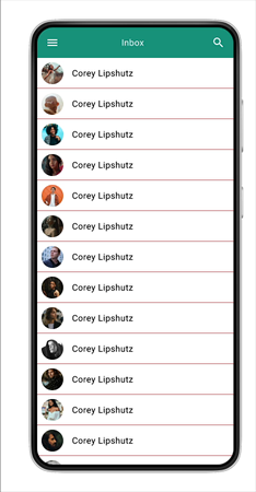
Overlay Draw
Overview
Create a Draw Overlay Interaction
Create your Components
1. Title Bar
Create a title bar 360 x 56 with a menu icon, a title and an icon in this case a search/magnifying glass. Add icons with either a plug-in or with an imported library.

2. Label with Avatar
Now we will create a label item 360 x 56 this will consist of the frame with an ellipse 40 x 40 shape containing an avatar and the name label. Text Roboto - Regular at 16pt

Create a bottom Stroke with the colour black
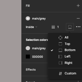
Text justified left - centred vertically and fixed size

List Item with rollover (for overlay)
Create a list item 260 x 56 save it as a component then create a Variant with the second Variant this will be the hover state so change the background colour
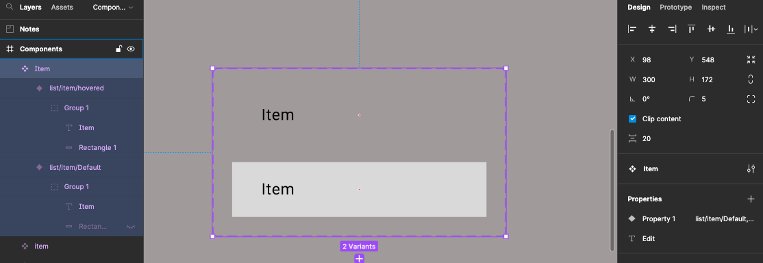
You can add interaction either do a While Hovering interaction or a mouse enter leave
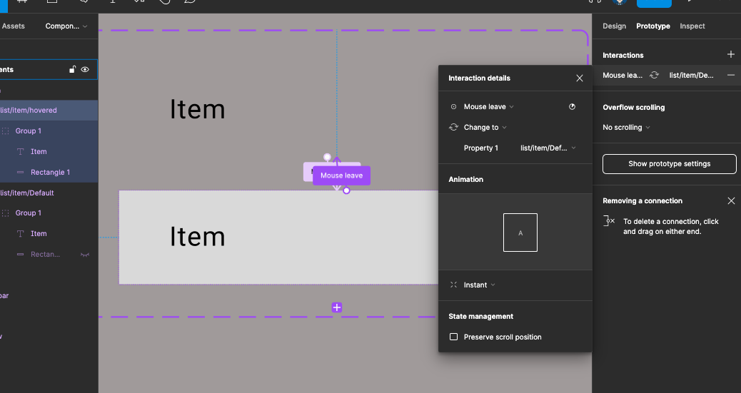
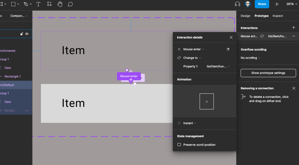
Overlay Draw Component
You will need to create a component to be the drawer navigation which will come in from the right of the screen this has a header with an avatar and a list of items. Size 260 x 640
Call the frame Draw
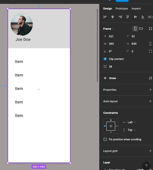
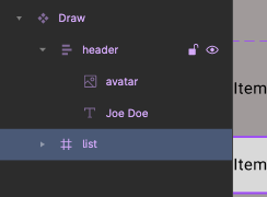
It will have a header with avatar and name with a coloured background.
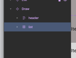
Create another frame and call it list under the header
Drag and drop the List item inside this frame ALT + SHIFT drag to duplicate as least 5 times
With the Draw frame selected convert it into a component by right mouse clicking.
Main List Items
You can now copy out an instance of your list item and duplicate it before creating it as a component
ALT + SHIFT drag to duplicate

You will now have the following components in the asset panel
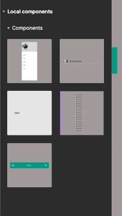
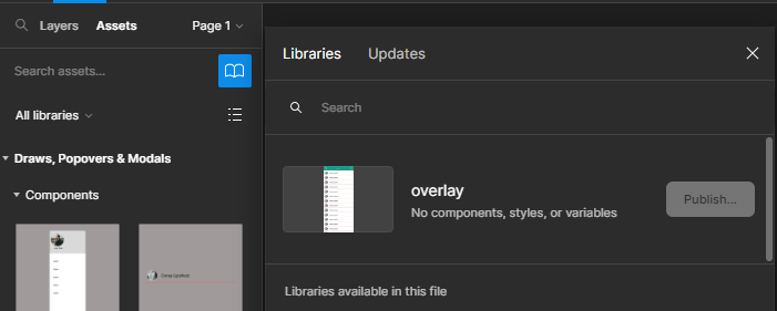
Now publish (this will only work if in a Teams Plan)
Once published we can create a new project/ Figma File and import if you do not have a Teams Plan you can use the in your Figma file.
Using your Components in a UI Layout
Create a new Figma File (Project) if you have a Teams Plan otherwise create a new page and create you UI layout on it.
- Create a new Frame 360 x 800 Call it Home
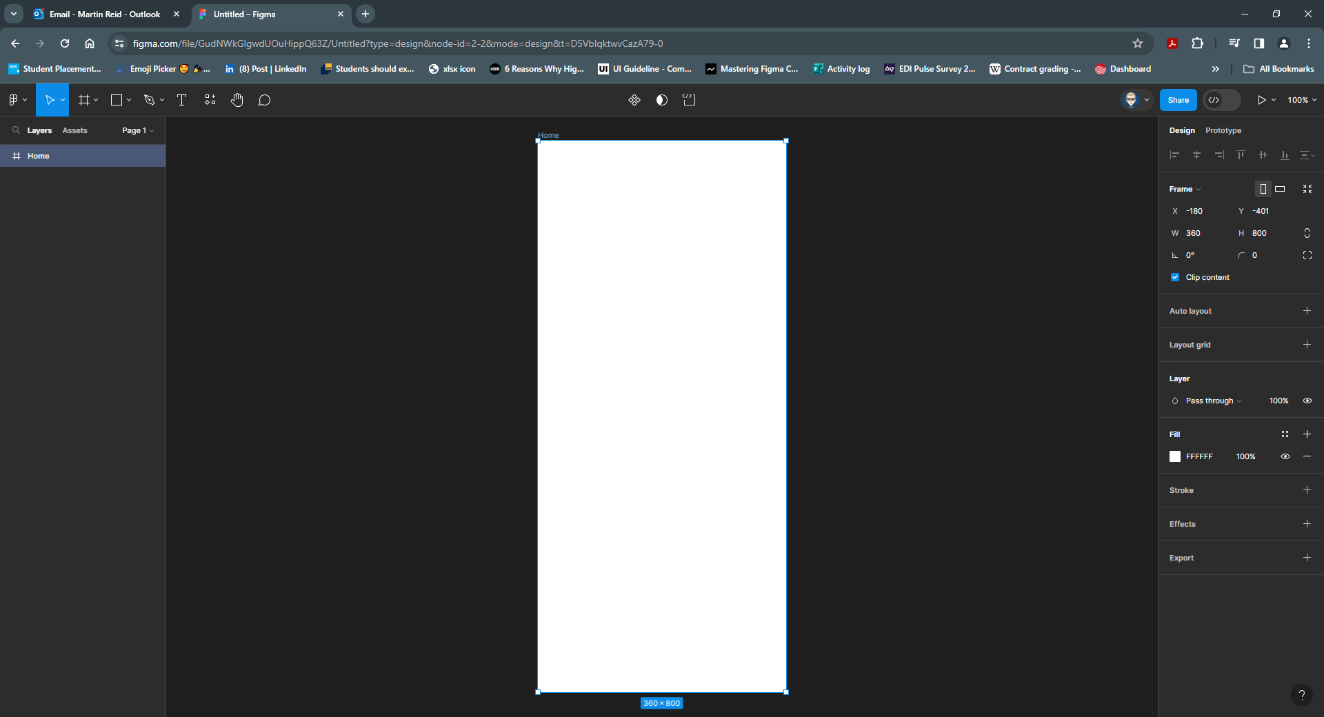
- The Assets (Components) have already been created and/or imported as a shared library into out File (Project)
Drag out the titlebar on to the Home Frame and position
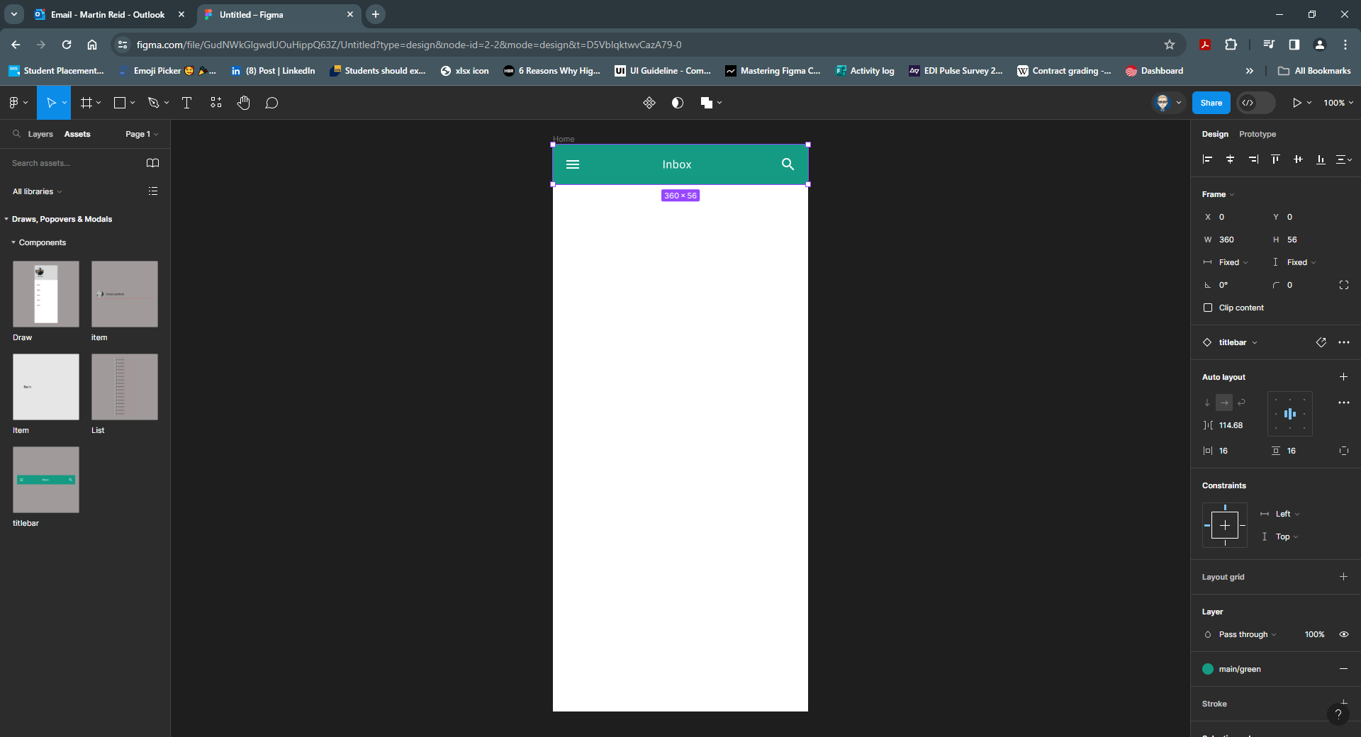
- Drag out List component and position
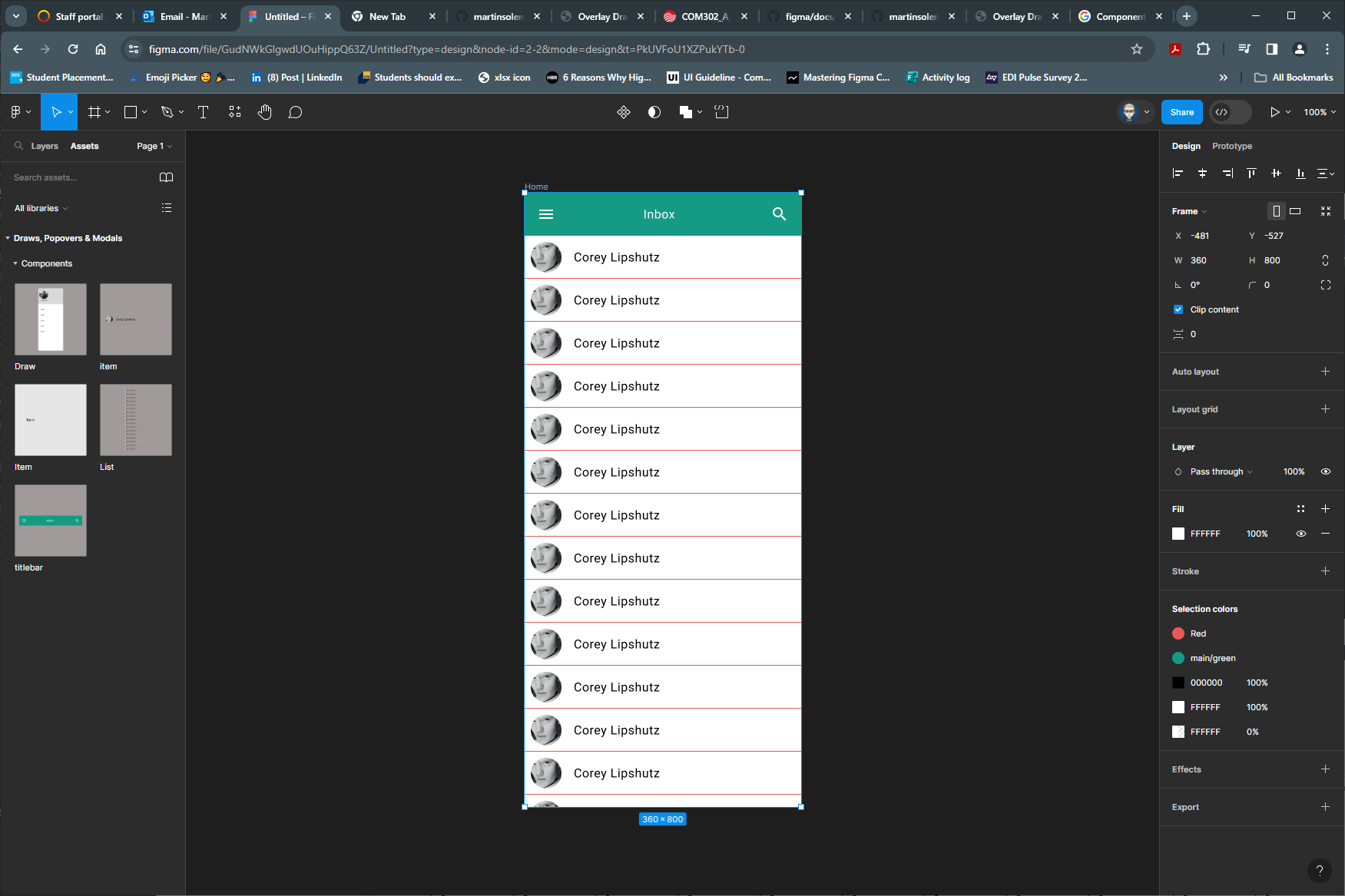
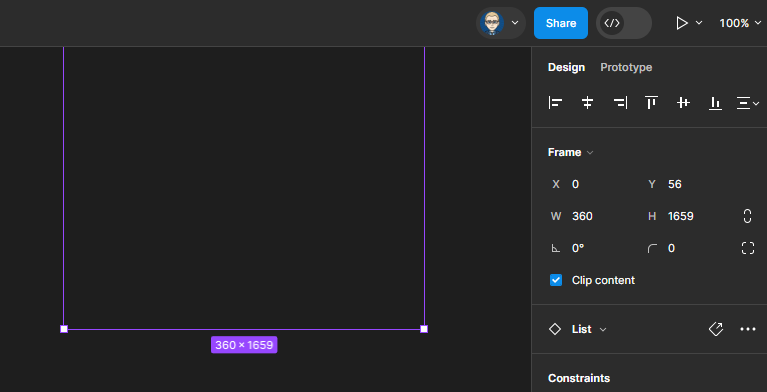
- Resize by dragging down the List component to make it 1659 high. It this case this is the “height” of the component that has been created to allow for a scroll affect
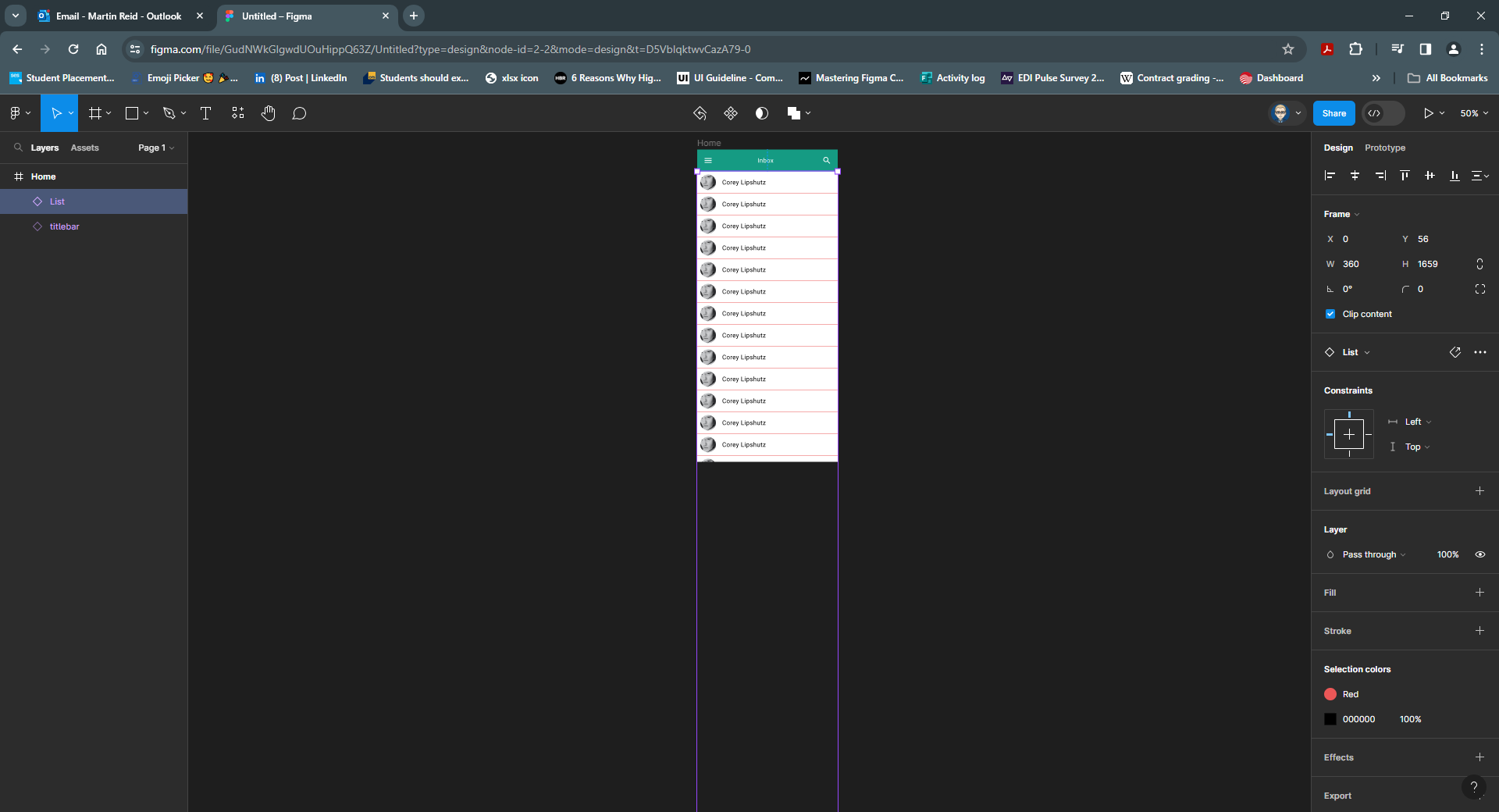
- Now select the titlebar in the Properties panel switch Design to Prototype
Within the Scroll Behaviour section change to Fixed (stay in place)
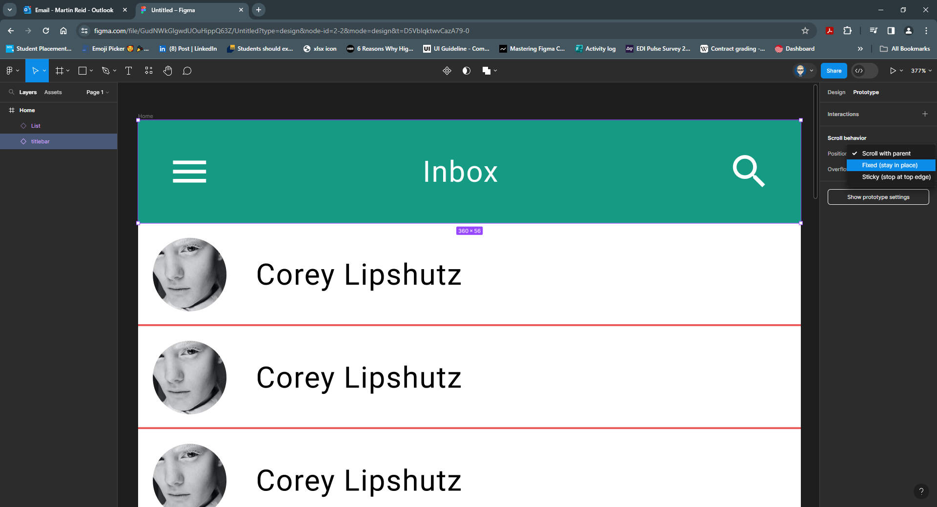
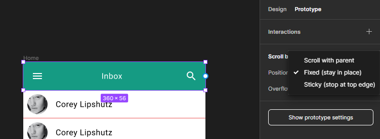
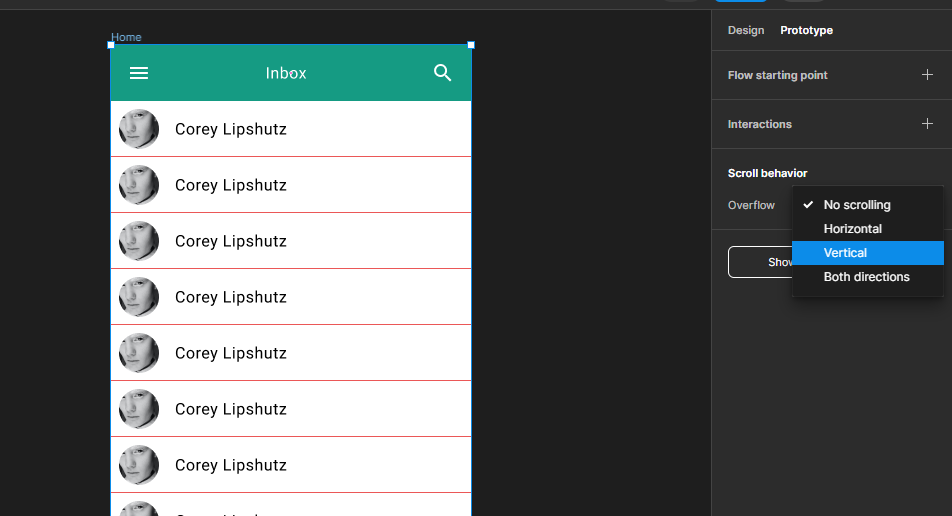
- Change Overflow to Vertical
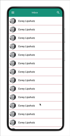
- Now in click Run to test the interaction
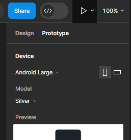
The Device has been set at Android Large
Your interaction should behave like this
Customise the layout
All Avatar images are the same, we need to change this. As we have called all of the Avatar we can install and use the
Select Similar Plug-in Select Similar Plug-in
Select one of the Avatar images.
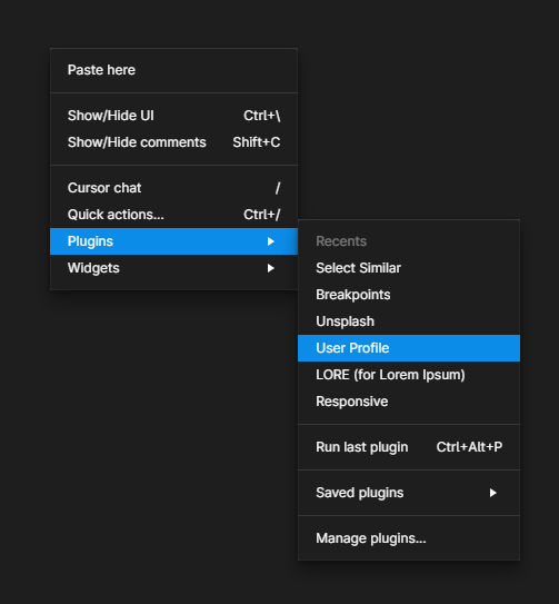
Then right mouse to bring up yje plugins and select Select Similar Plug-in
Check Layer Type and the Select Layer Sample button
Then click the Select Similar button
![]()
This will select ALL layers called Avatar
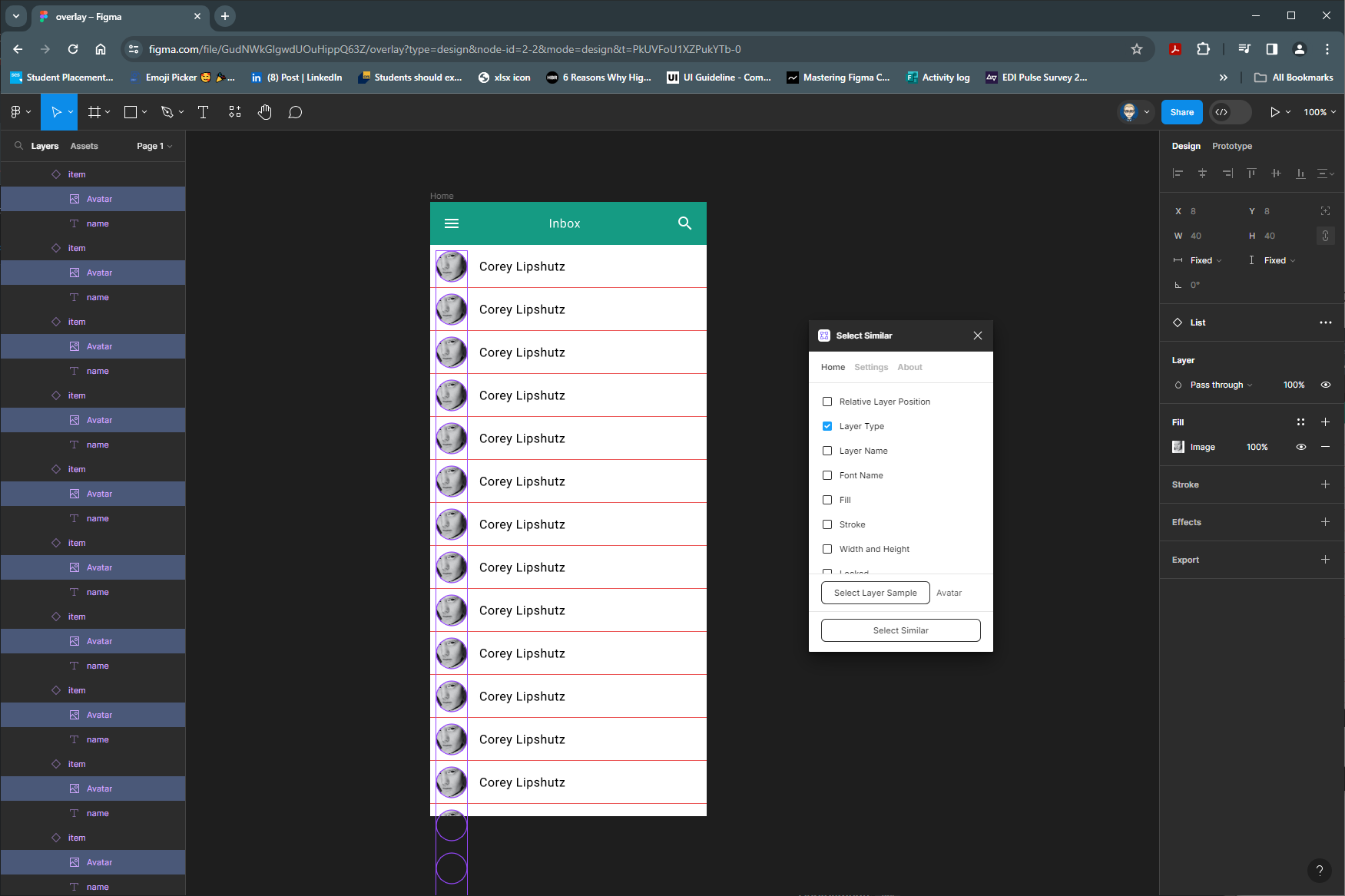
Now to change the images using the User Profile User Profile Plug-in
Once installed, right mouse and select User Profile
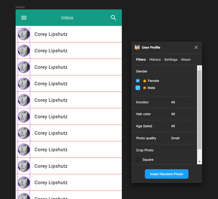
Select Male & Female and click Insert Random Images
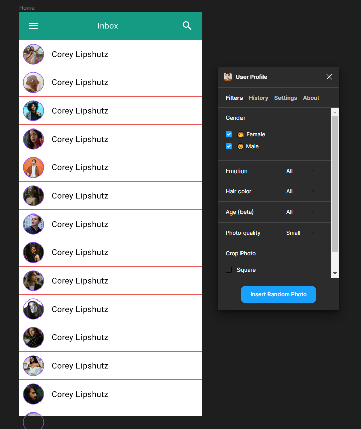
The image will be replace by random images
Add a left Side Draw Overlay
- Drag Draw Component from the Asset Panel
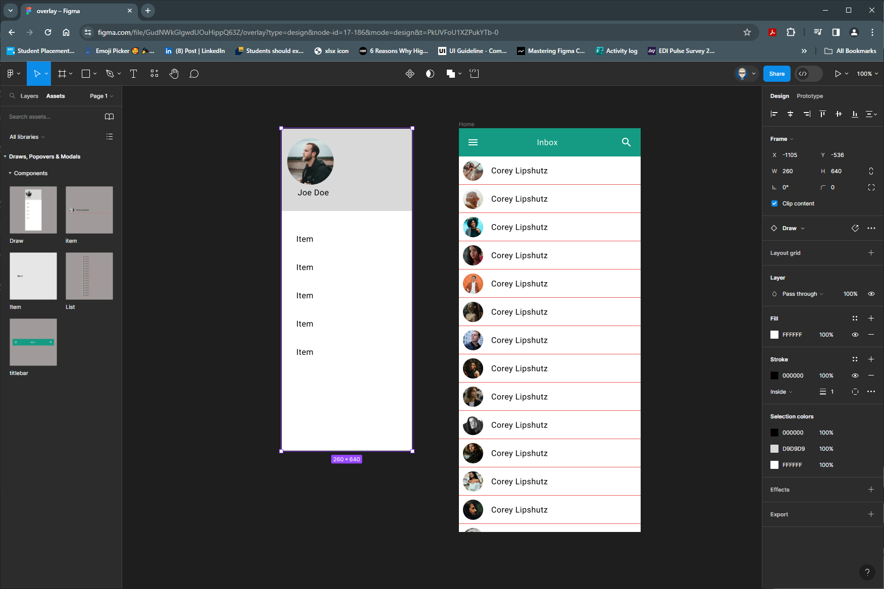
- Slect the Hamburger Menu icon on the Titlebar on the Home Screen
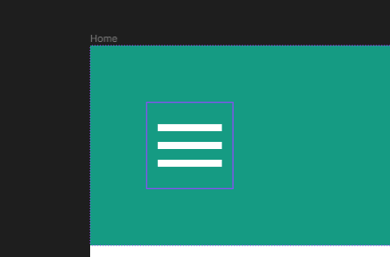
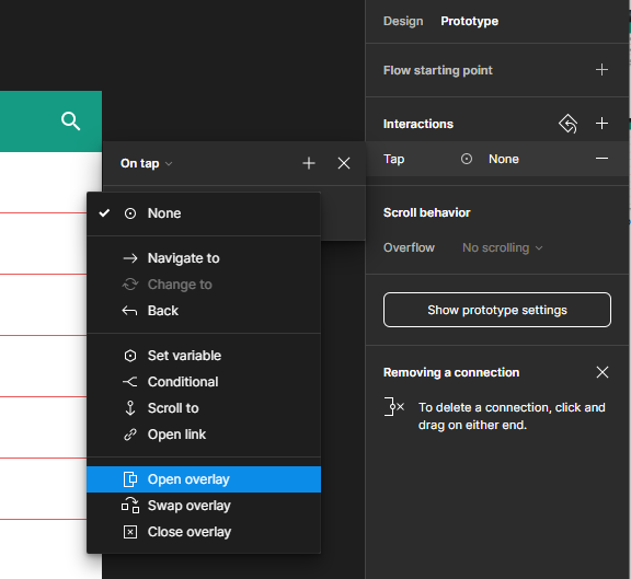
In the Prototype Panel on the Interaction section, click on tap

Change None to Open Overlay
Select Draw Move in Right And Top Left
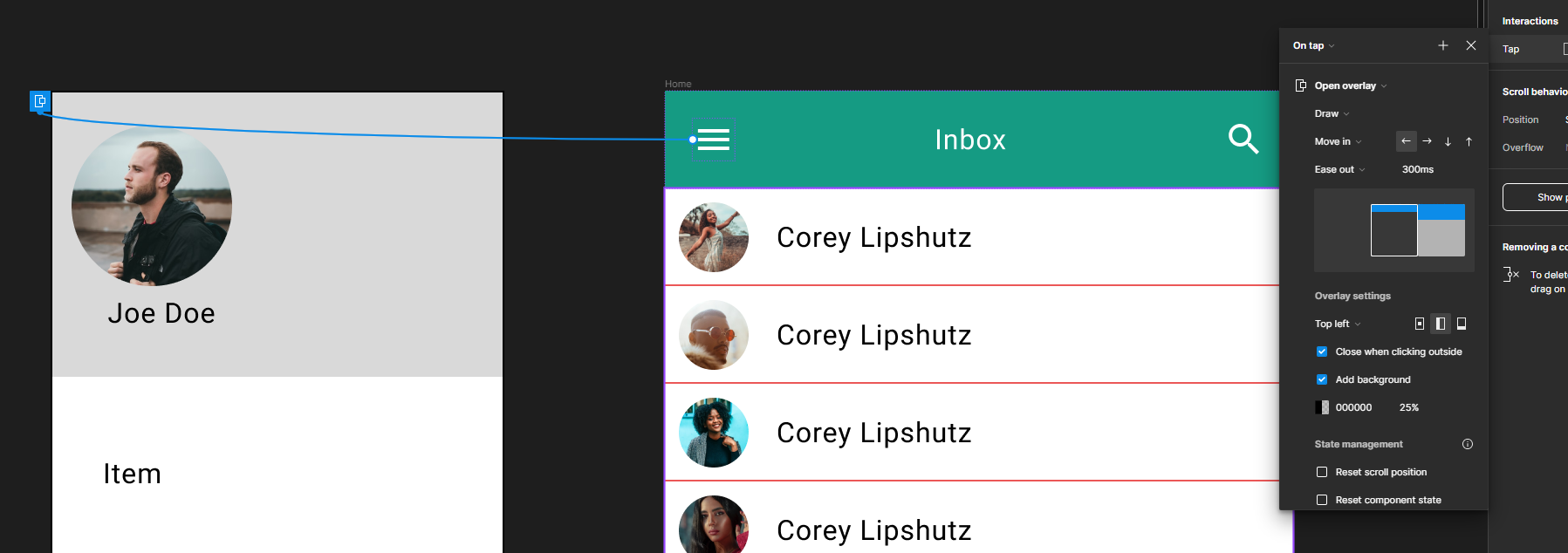
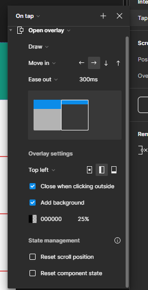
Final run the prototype again to test and check on your phone using the Figma app.
