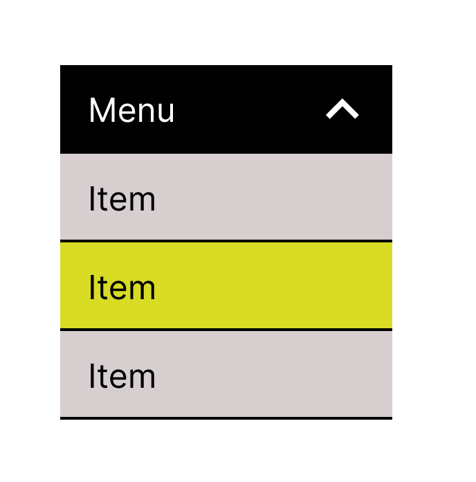
Drop-down menu walk-through
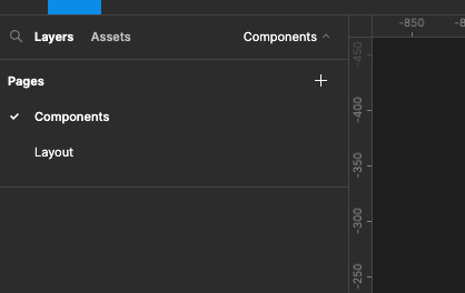
Create a new Figma project create a page for components and another page for the layout
Setting up icons
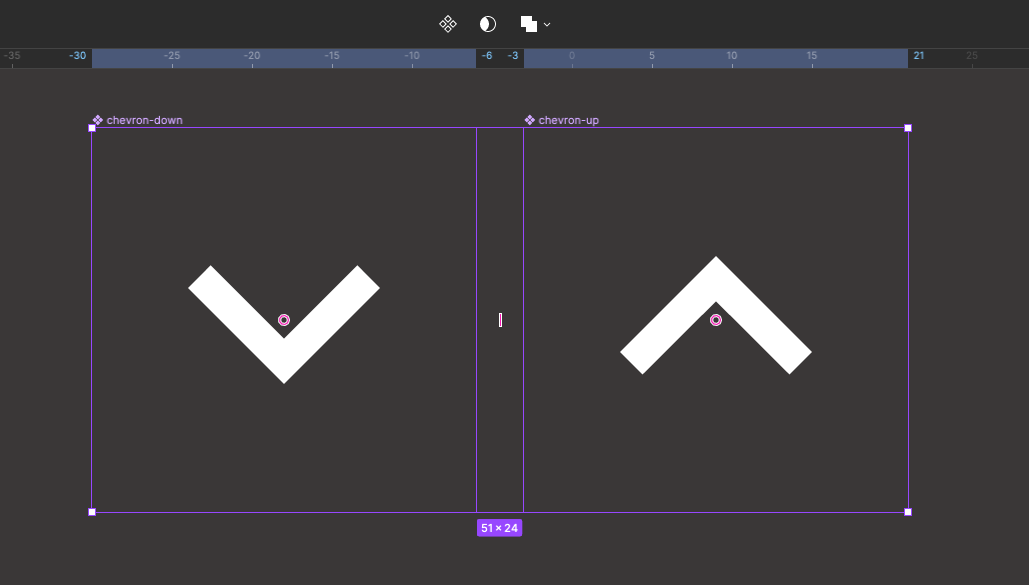
On the component page add two icons for up and down
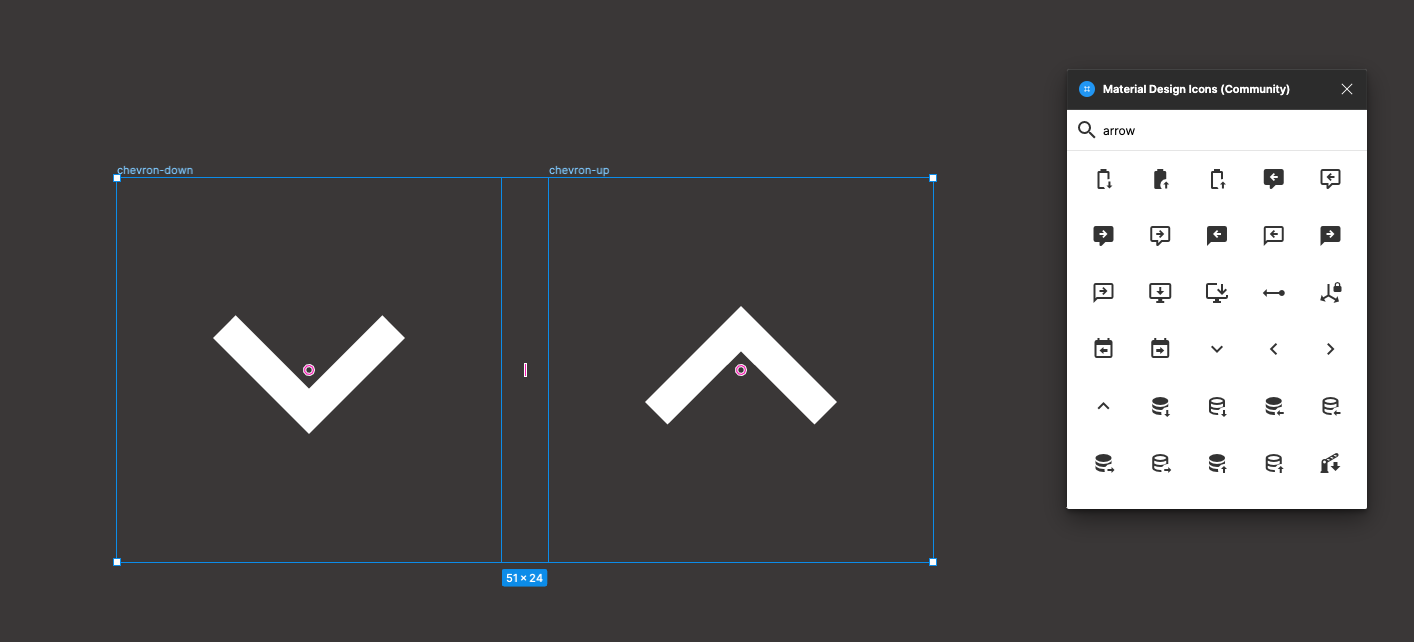
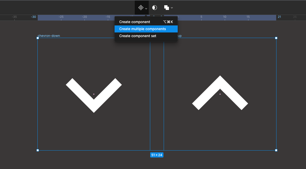
Select both of these icons and convert them into components
Create a Menu title bar
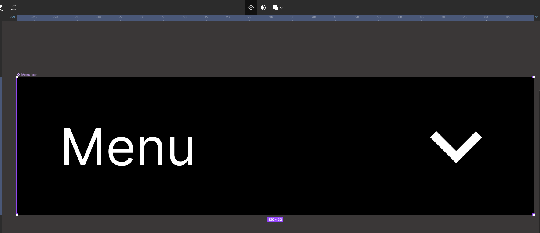
Now create a frame 120 x 32, change it to Auto Layout, aline centre middle and change the height and width from hug to fixed. Name the frame menu_bar

Select the text tool or press T on your keyboard type in the word Menu at 12 point font size

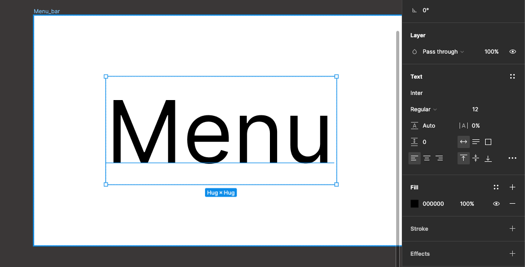
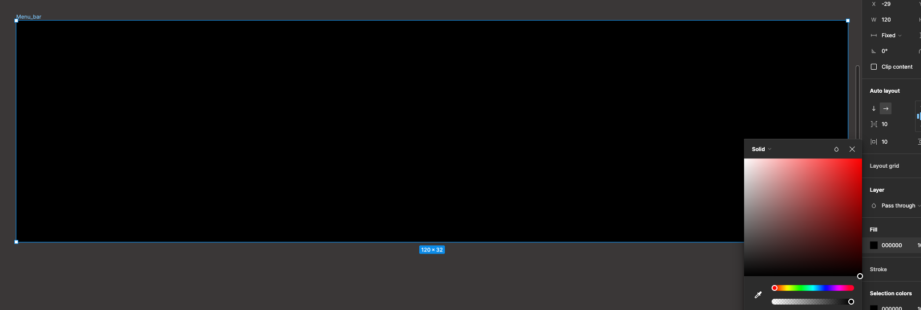
Select the back Parent frame and change it fill colour to black
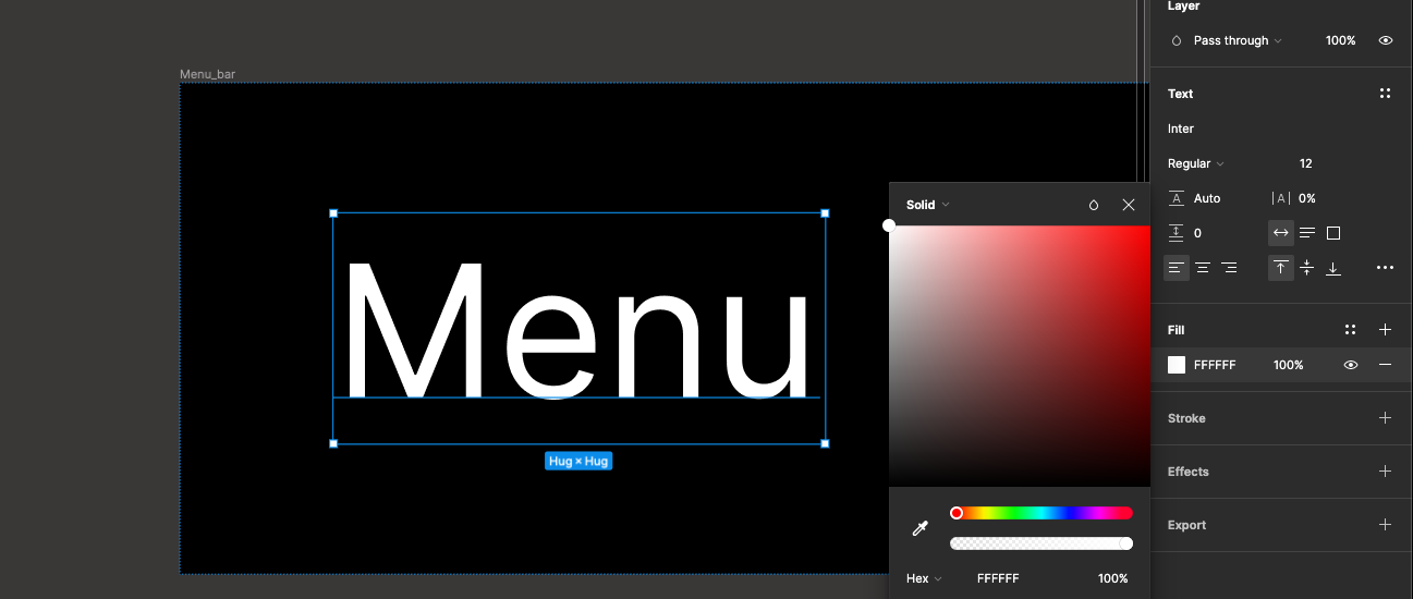
Select the text label and change the fill colour to white
From the acid panel drag out the down arrow icon onto your frame
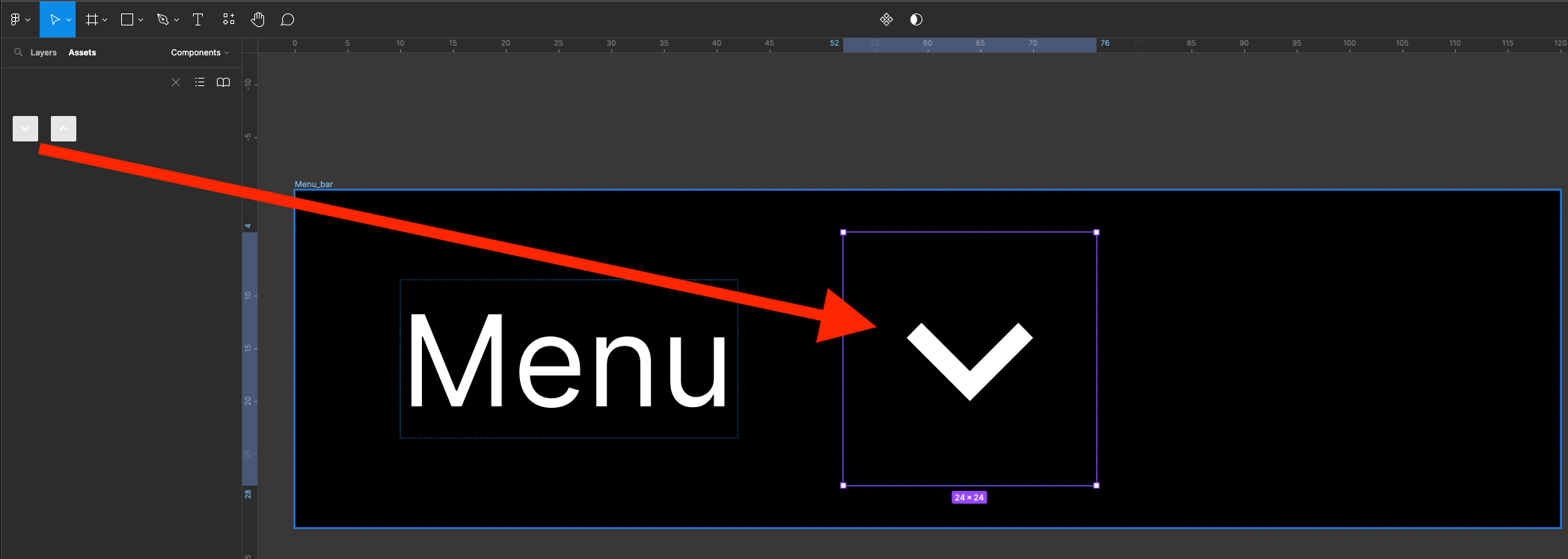
You can increase the gaps between the Menu text and the icon by dragging out the purple line in between the items

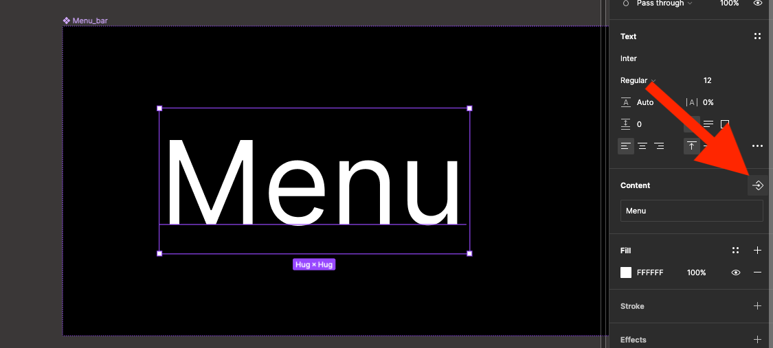
Now select the menu text box. In the properties panel on the right in the content section click on the icon to create a component properly
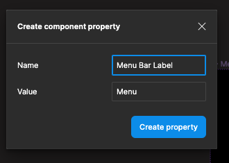
From the pop-up name the component property Menu Bar Label and click great property
Now select the icon in the properties panel on the right click on the image swap property icon
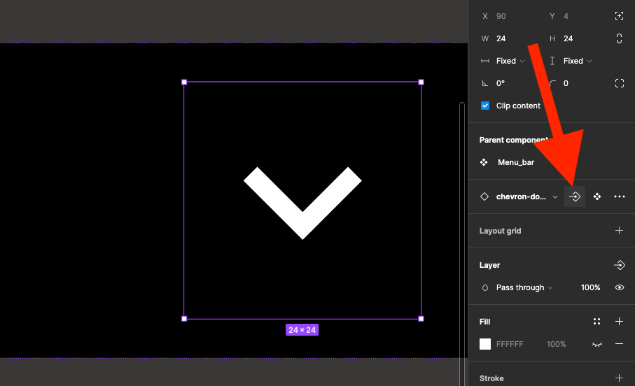
In the pop-up name the property icon
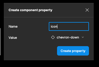
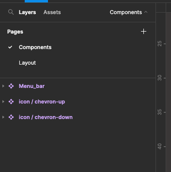
We will now take time to organise our icon components. To group them together type icon / before their names.
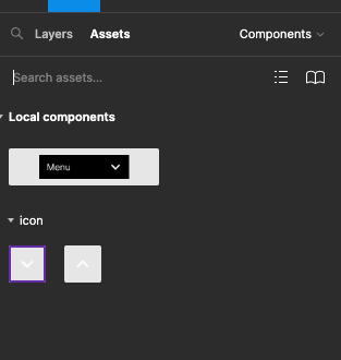
Check the Assets panel and you will see the icons will be grouped together
Creating a List item
We will now create a list item for the drop-down list. Create a frame 120 x 32, give it a light grey colour, auto layout - centred left with the width and height fixed (not hug)

It’s like the textual T on keyboard type in Item

Select the frame and convert it into a Component
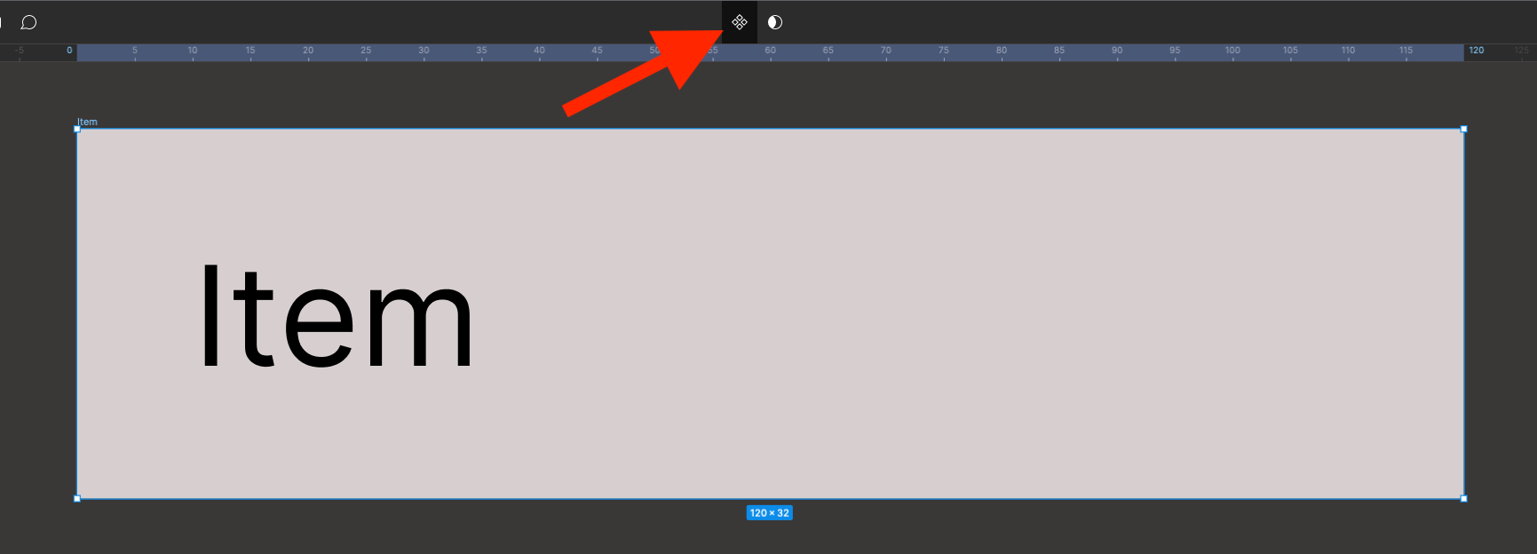
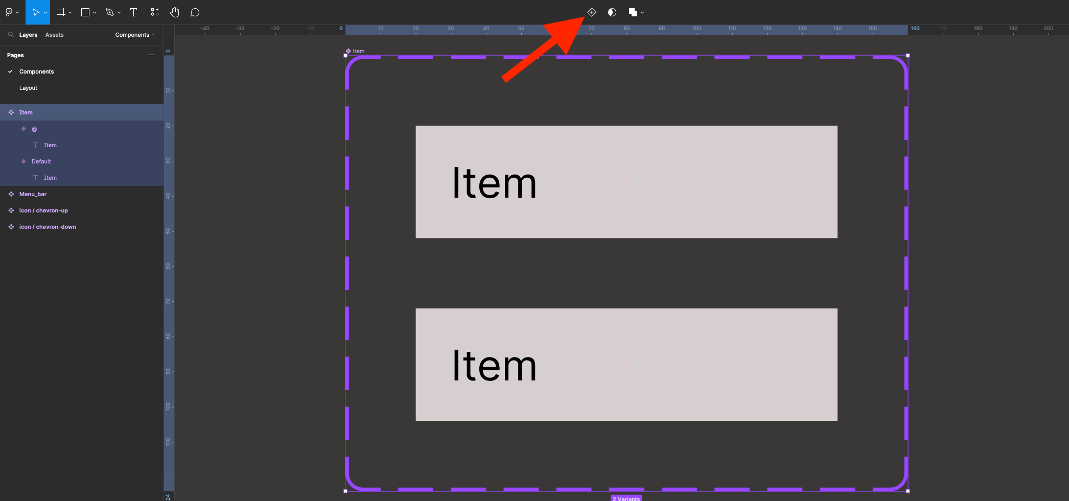
Now created into a Variant
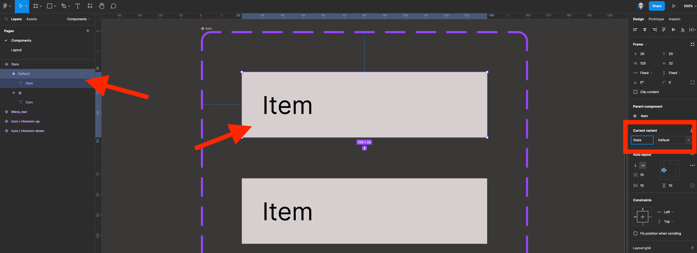
Select the top Variant item (Default) in properties panel on the right in the Variant properties change Property-1 name to State
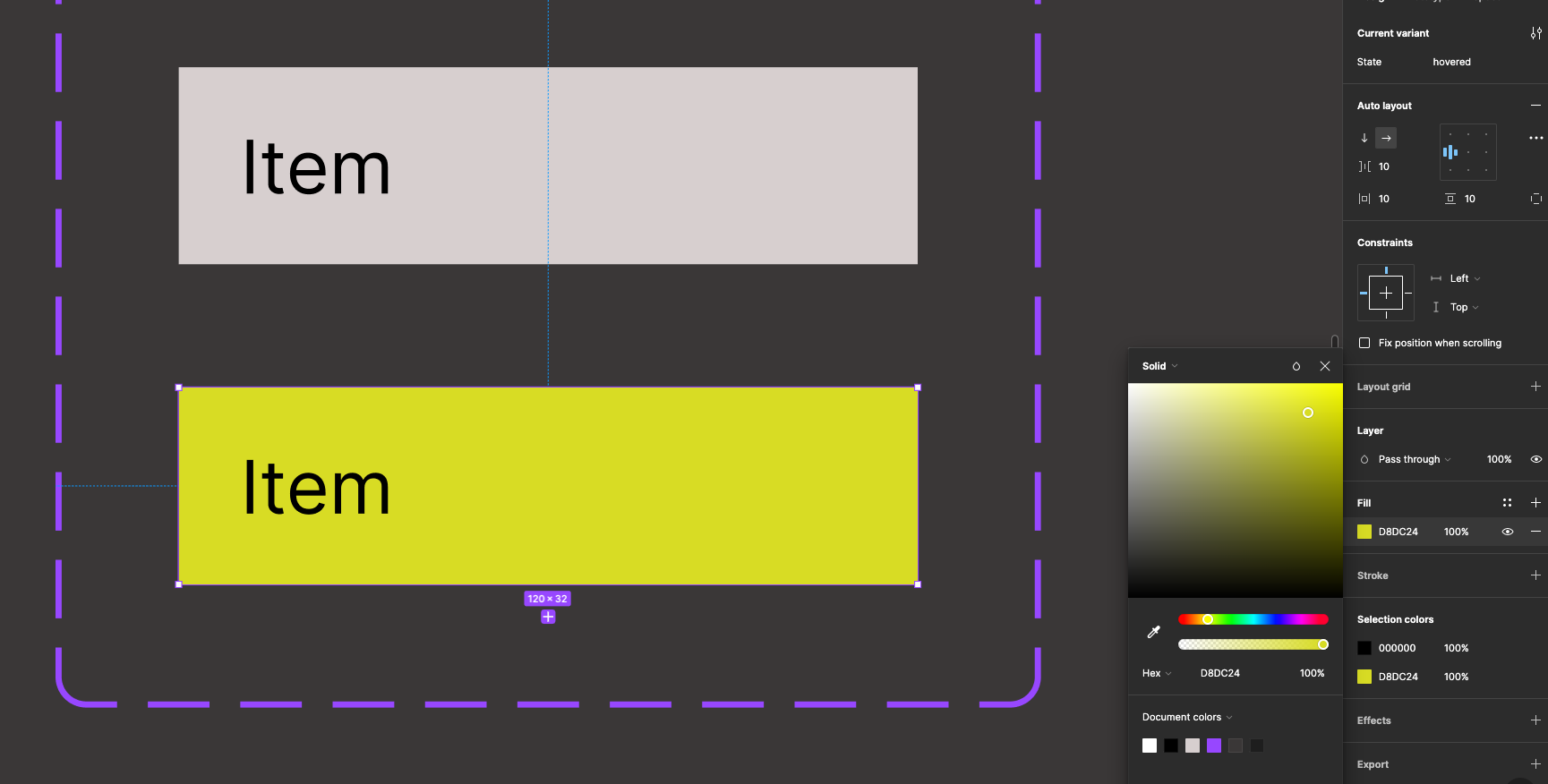
Now select the second variant change it State name to hovered

Now, change the colour of the second Variant - this will be the colour it will turn into when the mouse is hovered over this item
We will need to put a stroke at the bottom of each of the variant items to separate them in the list. Shift-click both the variant items
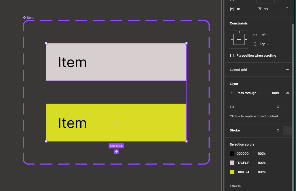
Add a black stroke.
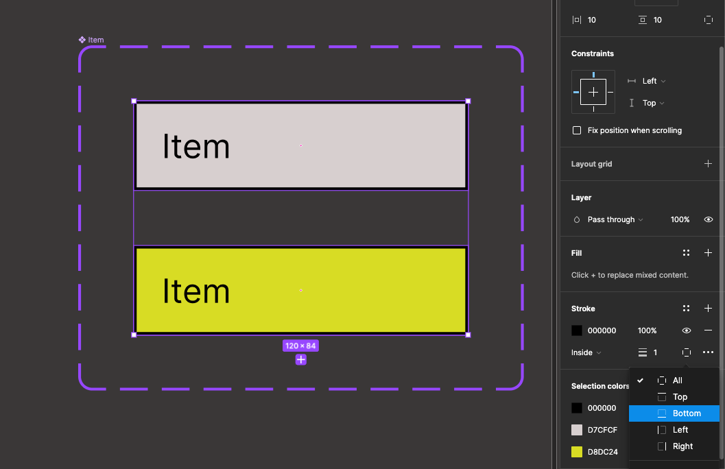
Change the stroke from All to Bottom
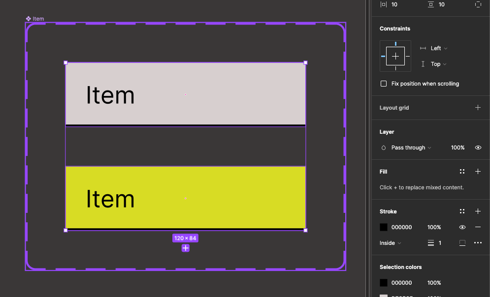
Add a list item group to the menu bar
Click on the Assets panel and drag out an instance of the menu bar
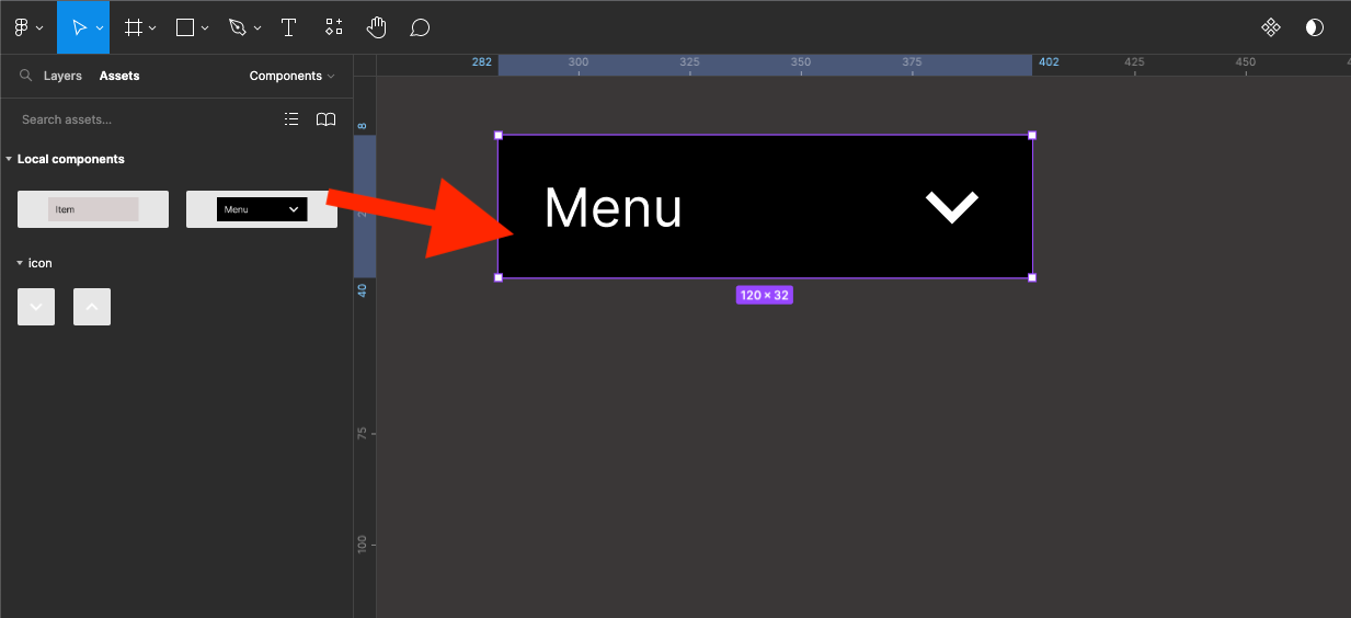
Now drag out an instance of the Item component
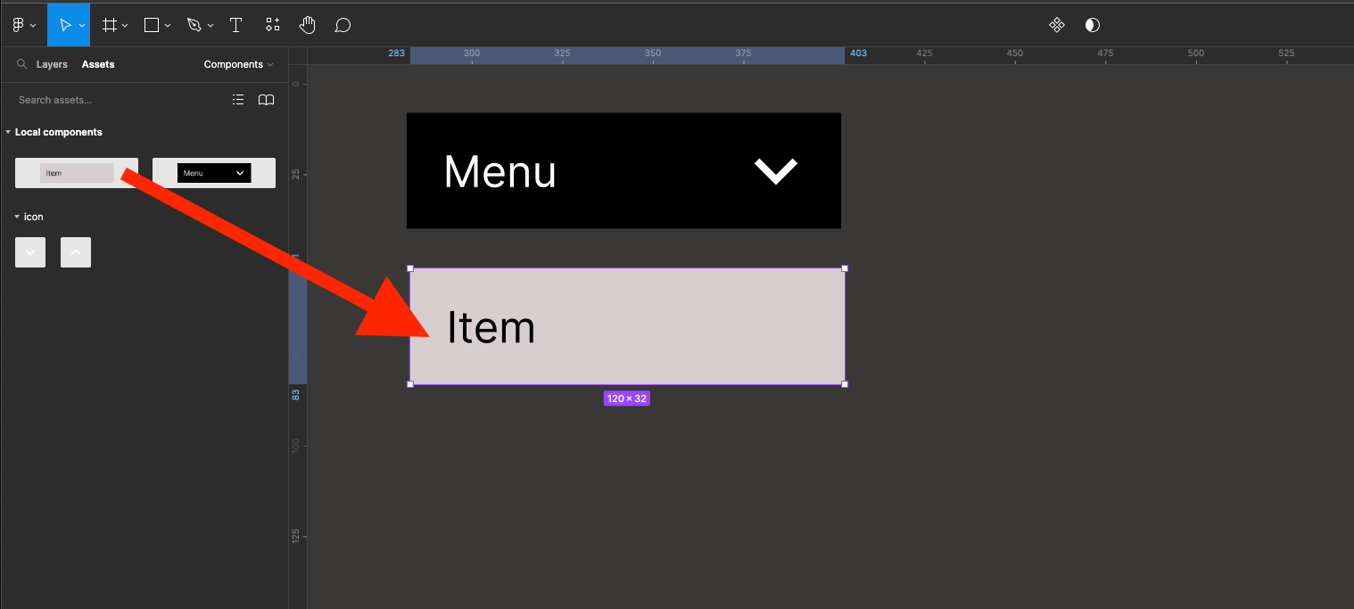
Who is the item so it sits directly underneath the menu bar
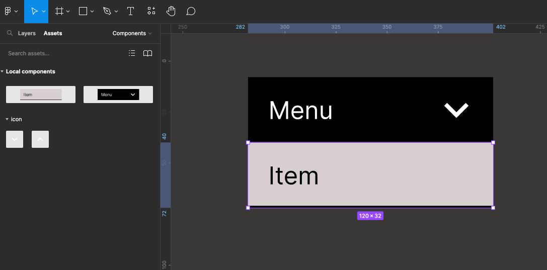
Hold hold and shift on your keyboard to drag copy of the list item
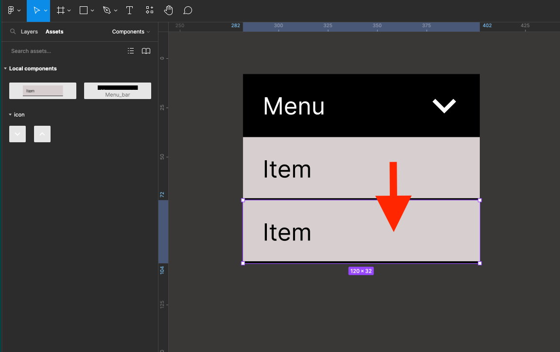
You can press Command+D on an Apple Mac or Control+D on a PC to duplicate a third item
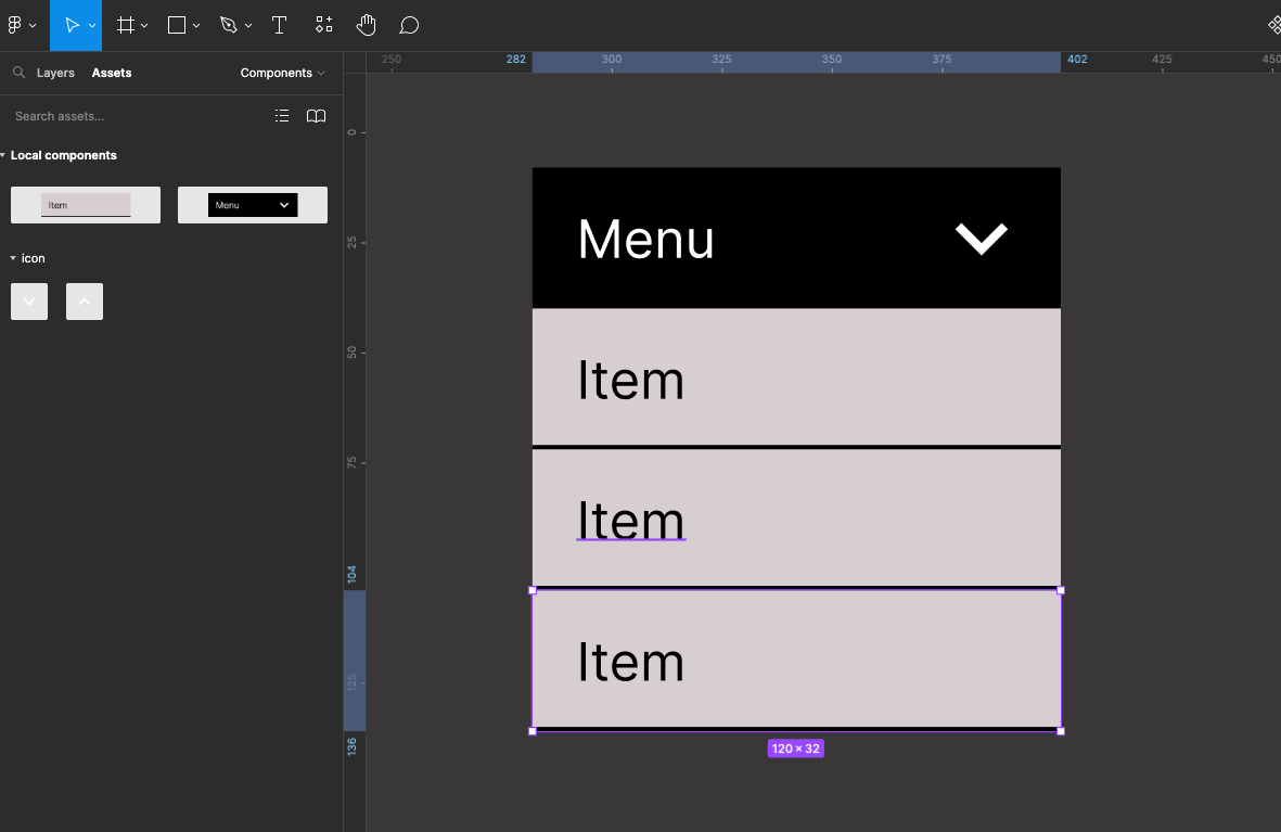
Shift click each of the 3 items to select them - either on the canvas or in the layer outline
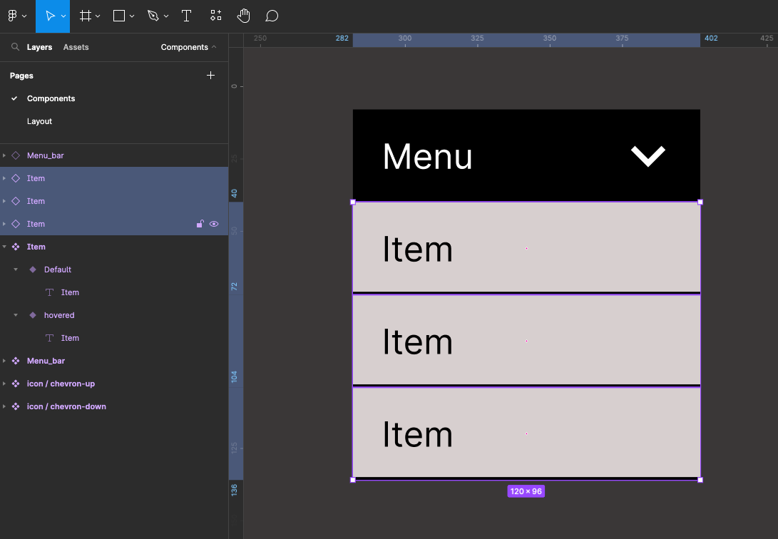
Group these items together either by right mouse-clicking and selecting Group Selection or on a PC Command+G and on a PC Control+G
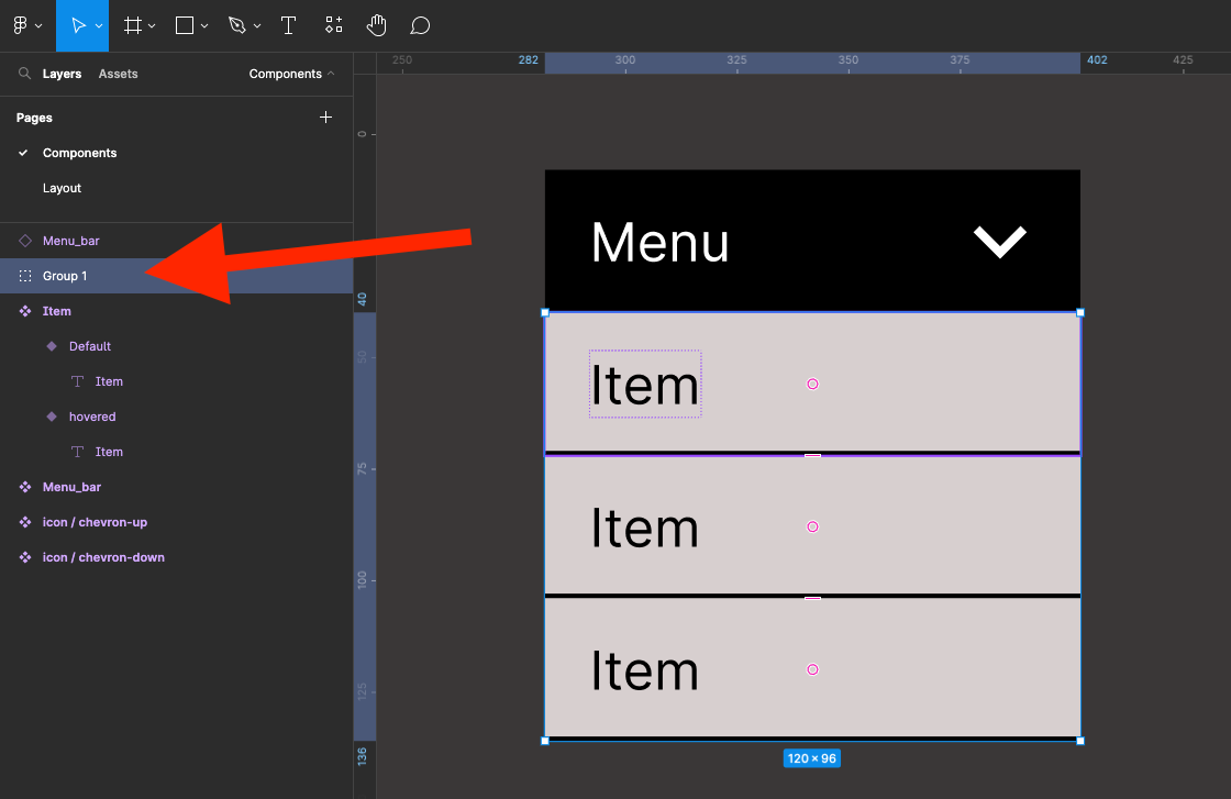
Name the group list in the layers outline
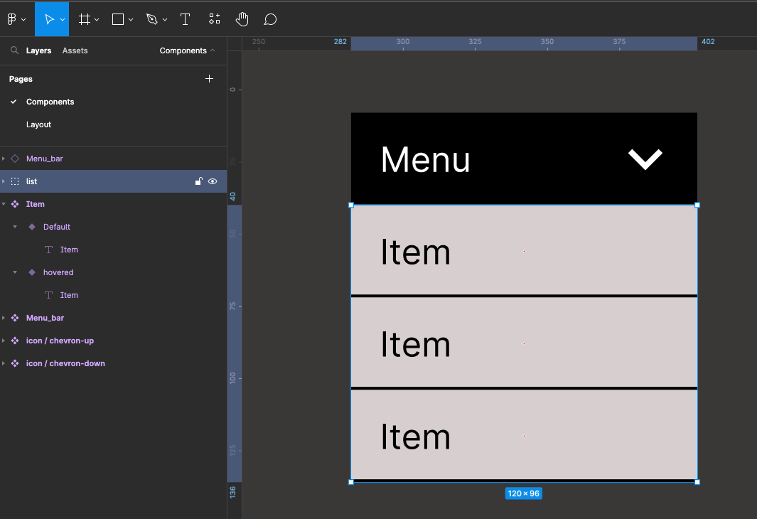
Select both the group list and the menu bar then create a Component - call this new Component dropdown
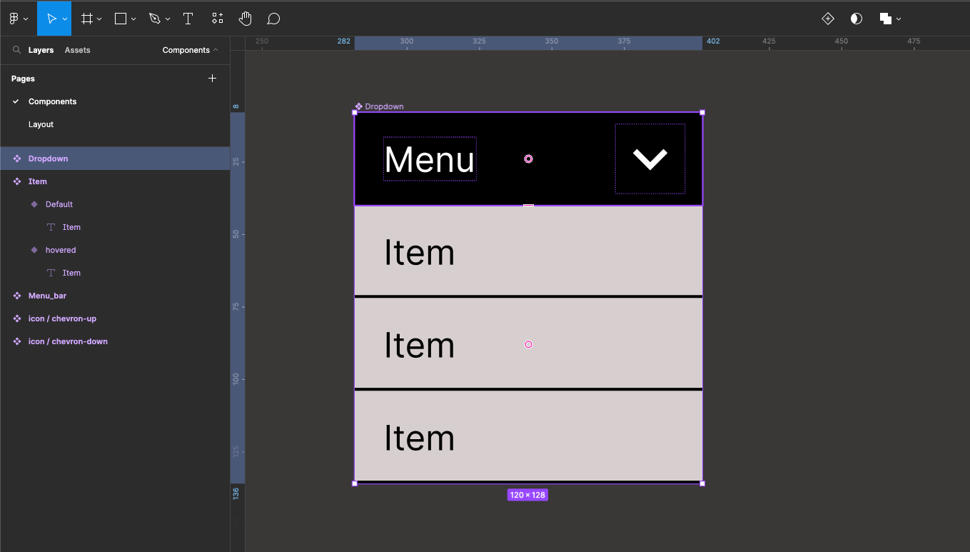
Now turn the Component into a Variant and select the top Default Variant
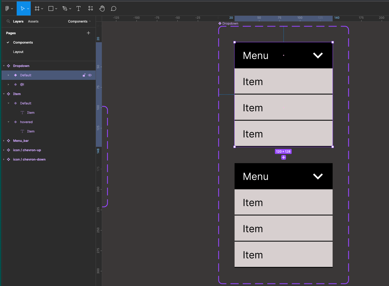
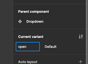
In the property side panel in the variance section rename property to open
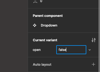
Do you name default to false
Your layer outline will now look like this
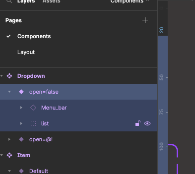
A turn off the list layer on this variant
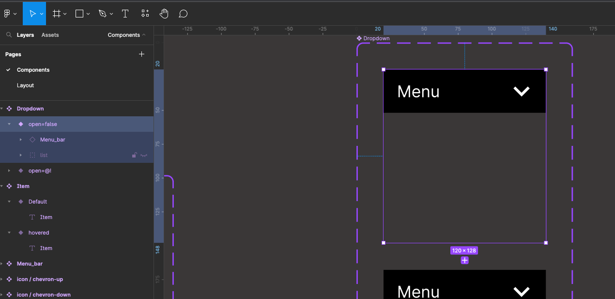
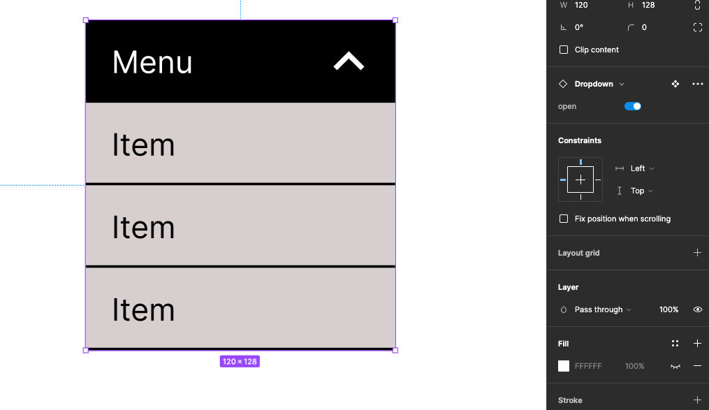
Now select the second variant (bottom) and range is open property state to true
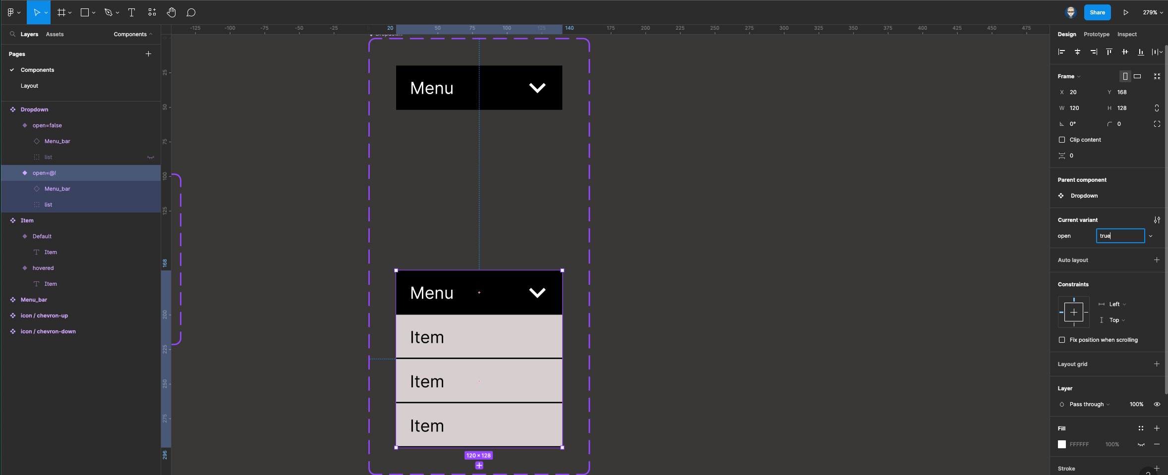
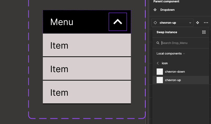
We now need to swap out the down arrow for the up arrow. Select the arrow icon and in the properties change it for the up icon
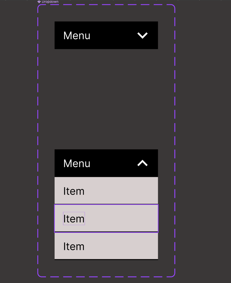
Go to the layout page, create a new frame and drag out an instance of the Drop-down Component onto this frame
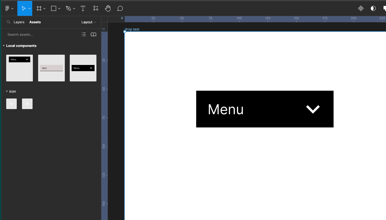
Use the toggle switch in the properties panel to open close the drop-down menu
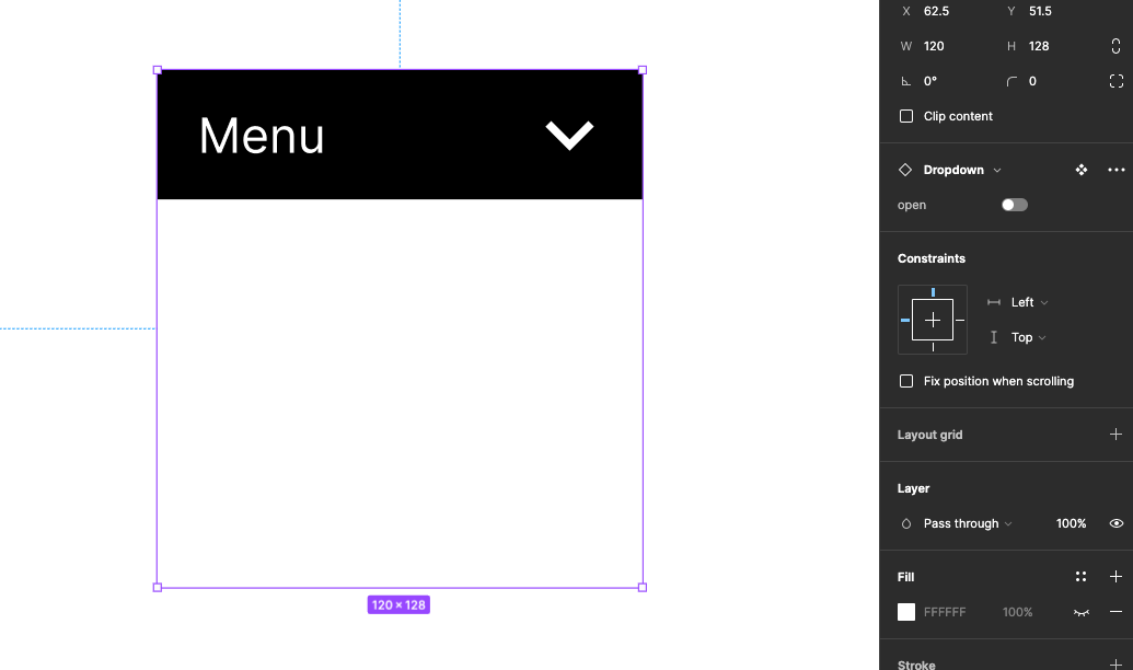
Prototyping and creating interaction
We will now create the hover interaction on the list item. Select the top varian. Switch to Prototype in the right panel then drag out a connection to the second hovered variant.
Change click to while hovering - and the State should be displaying hovered
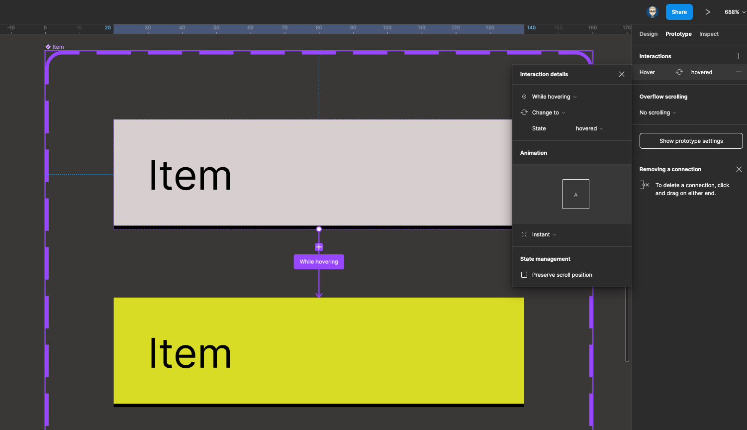
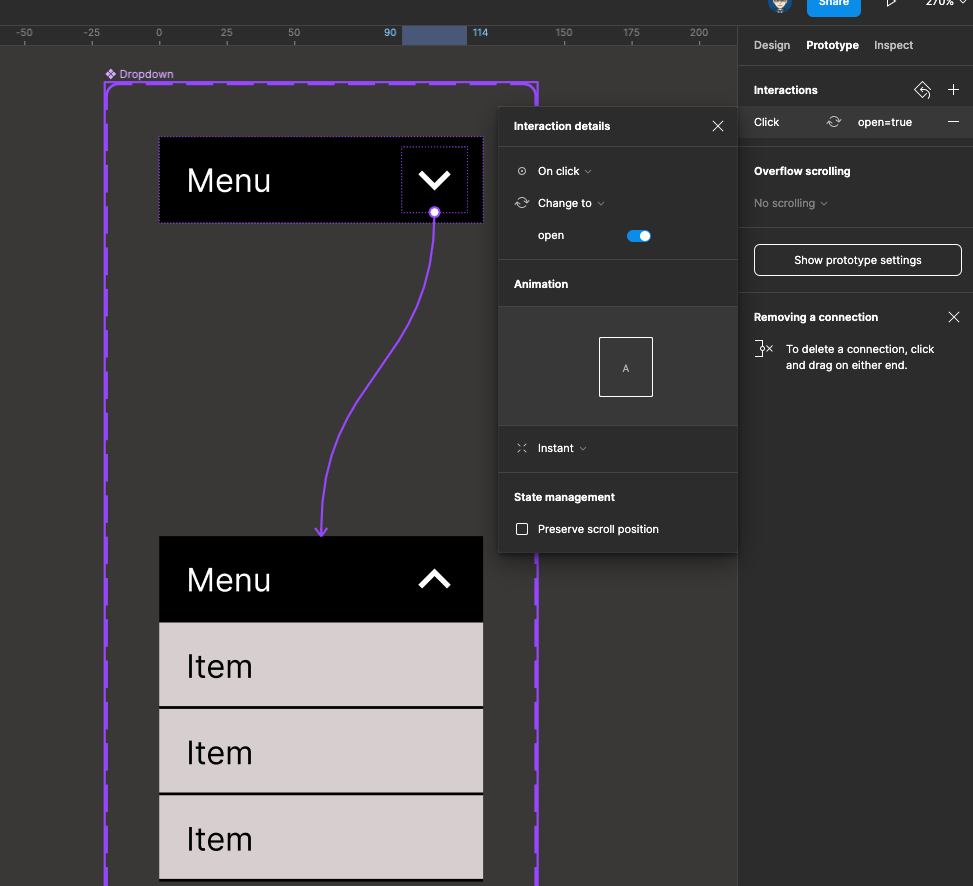
Click on the top down icon on the top variant drag out a connection to the bottom variant - On click and Change to interaction with the toggle switch for open switch on
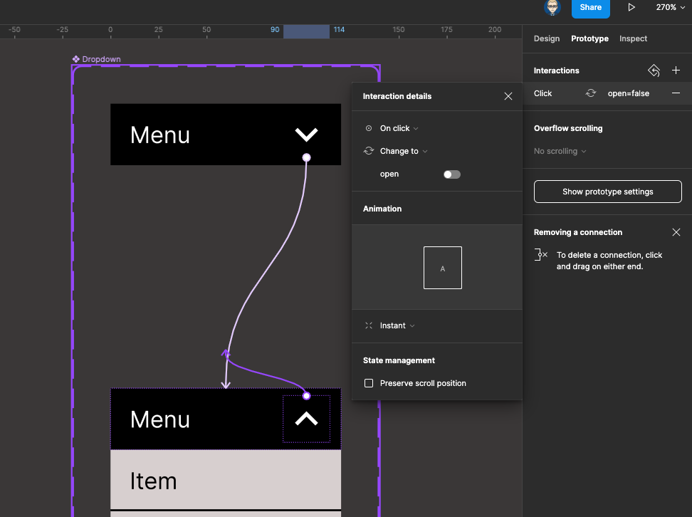
Click on the up arrow icon on the bottom variant and set up an interaction for On click change with the toggle switch for open off
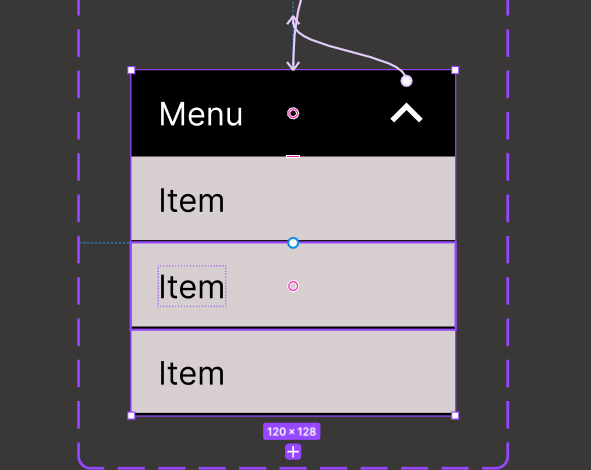
Select the whole of the bottom variant
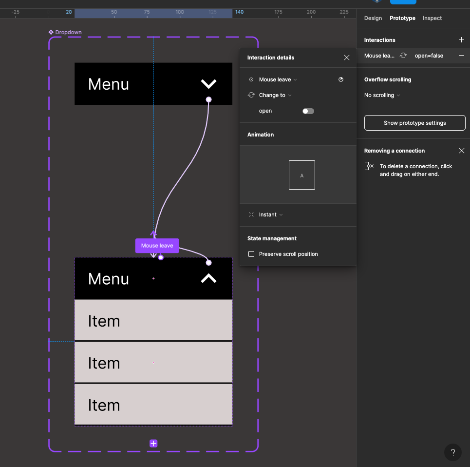
Click on the plus icon next to interactions in the side panel, set up Mouse Leave and Change to with Open toggle off
Now go to your layout page and run the prototype it should now be able to open and close and the rollovers should work on the list items
